Redesigning an online clothing store that struggles to sell its great products — UX Case Study

Ever stumbled upon a brand that offers fantastic products but their website makes it surprisingly terribly difficult for you to actually buy them?
You’re not alone! Recently, while browsing on social media, I found this unique clothing brand called At The Moment and I quickly fell in love with them. Here’s why: At The Moment is a California-based clothing brand that is run by a diverse team of young creatives and offers uniquely designed, high-quality-printed clothing and accessories for fair prices. Not sold yet? ATM has a zero-waste mission and is committed to following other sustainability guidelines.
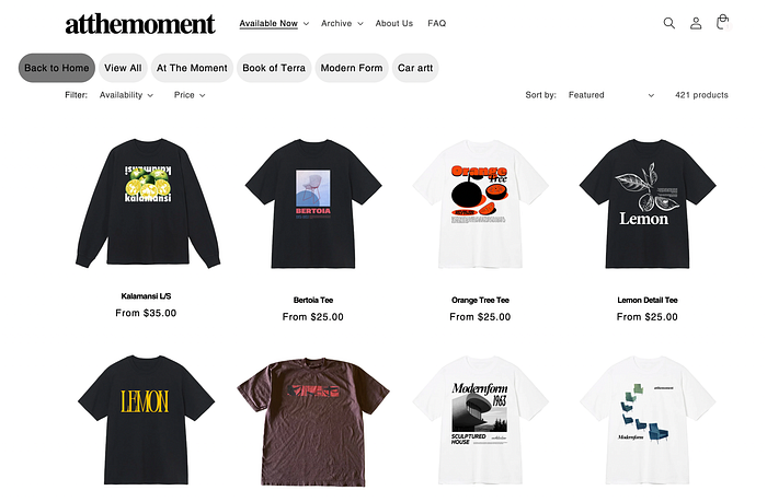
But here’s where all the drama started: I hopped on their website and sadly realized that they make it way too hard for me to find what I need - although they actually have it!

Above you can see At The Moment listing some of their products on their landing page. Ask yourself: Where would you look for hoodies? … exactly!
OVERVIEW
1) Problem
2) Research
3) Ideation
4) Clickable Prototype
5) Iteration
6) Final Thoughts

Problem: At The Moment’s website is perceived as confusing and frustrating when searching for specific products. Users need better navigation that helps them select a wide range of categories and filters in order to find products.
My plan was to propose a user-focused solution within a two-week timeline.
Solution: At The Moment has to follow more universal design language patterns and showcase its unique products in the most common and successful ways. More solutions later!

1 ) Competitive Analysis: When comparing At The Moment to large competitors such as Nike, Adidas, and Stüssy, it became clear that ATM was lacking many features. Even compared to smaller competitors like Virgirl Normal, it wasn’t looking quite good at all. It became clear that ATM was missing many standardized filtering and navigation features:
At ATM, you can only filter availability and price, and some weirdly limited collections and categories. In contrast, at their big competitor Nike, you can additionally filter gender, sale items, color, size, material, and an extended list of categories.
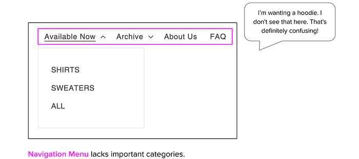
2) Heuristic Evaluation: I spent hours navigating through the website. I found more cool products which I saved for later. But more importantly, when evaluating the heuristics, I realized that many highly severe violations occur across the page:

Above you can see three violations that are in line with my mission to make the navigation and filtering tools more efficient. But don’t worry, I fixed all the other issues as well!
3) Usability Testing: I met with four participants who all identify as computer users over video calls to understand how they interact with the website and in order to identify potential pain points. While observing the users perform the following tasks, I was metering time, success, and easiness: 1) Create an account. 2) Find specific products and add them to the cart. 3) Find out about the material/fabrics of a product.
I observed the following: Users perceived At The Moment’s website as aesthetically pleasant and enjoyed the products. But they got confused and frustrated with the navigation while searching for specific products. Here’s what some of them had to say:

Shirts, Sweaters, All, and that’s it? Come on now, there has to be more than that! Where are the hoodies, jackets, pants, shorts, bags, and hats located?

Why do we have “Availability” both as a category in the main navigation and as one out of two filter options? Fairly, it makes absolutely more sense as a filtering option. But still! Why?

What the heck are those button-like-looking things here? After spending a good amount of time figuring it out, I realized most of them represent ATM’s collections. But why are they mixed up with a “Back to Home” button?
4) Journey Mapping: After analyzing At The Moment’s website, social media, user interviews, and target audience, I was able to build a persona named Jorge and draw his journey of searching for a plant-themed hoodie:

See those emojis? Not to get emotional here, but they are far from being happy when trying to find specific items or categories. As a highly empathetic person, this makes me sad :( My mission is to get Jorge back to smiling until his cheeks hurt!
5) Card Sorting: Clearly, the navigation had to be reorganized. At The Moment needs more main navigation features and subcategories that support an easy user experience.
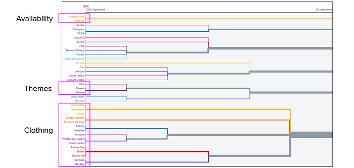
I asked ten participants to group all the subcategories that could be found on the current website as well as other subcategories such as coach jackets and beanies that were already existing but haven’t been included in the navigation.

To be fair, this open card sorting was pretty wild! But it became clear that the majority of the participants agreed to group clothing subcategories as well as themes.
With the confidence of knowing that I was on the right track, I asked another ten participants to do some closed card sorting: I gave them both main categories (inspired by competitors) such as Business Info and Clothing and subcategories like Contact and Hats, and asked them to pair those:

This process went surprisingly really well which is most likely based on the fact that all participants are regular online shoppers and are familiar with many of the competitors. All of them even sorted the quite abstracts terms Bottoms and Tops to the main category Clothing. I thought they would be much more confusing. I realized it was absolutely fine to use this terminology! The majority also threw Hats in the Accessories box and didn’t expect them to be found under Clothing. Before doing my research, I always thought hats would be considered to be a piece of clothing.
6) Additional Competitive Research: Before moving over to the ideation phase, I compared popular clothing retail websites in order to get an understanding of market standards and trends.

Since it’s important for this project to implement many universal design patterns and use navigation features and User Interface elements that are used on popular competitive and comparable websites, I got inspired in terms of layout, color usage, fonts, and more.

1 ) Sitemap: Based on the card sorting and the market research, I created a sitemap for the new At The Moment website that was supposed to clearly and quickly showcase the most relevant (sub-)categories:

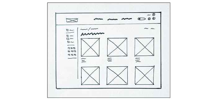
2) Sketches: When sketching ideas for the layout, I was focusing mainly on the Main Navigation bar and the structure of the Product List page. Based on my research, it was clear that At The Moment’s new website needed to show the main categories at the top bar and list the subcategories when hovering over the main navigation. In addition, it was important to create a sidebar that would add additional filtering options:

Since ATM is popular for its unique prints, it was of high relevance to only show a few product previews per line so that the prints could get enough attention. I went with the rule of three.
3) Wireframes: When working in Figma, I created wireframes for the landing page, the product list, and the product page.
The top bar shows a clearly structured listing of the most relevant categories. When hovering over the elements, a more detailed list with subcategories drops down. In addition, the search section can be easily found through the box, the icon, and the label:


The new footer shows relevant features such as business information, a help section, and promotions:

On the product list, I added a sidebar that offers additional filtering options:

On the product page, we can find a size and a garment guide which are both slightly hidden but can be found easily at the same time. To keep it minimalistic, other minorly relevant features such as shipping information, care instructions, and reviews are represented through drop-down features:


I added a few high-fidelity elements such as branding photos and product images to add a more realistic touch to my wireframes.

Using Figma, I connected the most relevant features such as buttons and made them clickable. I added additional features including hovering options. Please find a walk-through video showcasing the first version of the clickable prototype below (iterations attached):

When testing the prototype I gained mainly positive feedback. But here are a few things I had to take into consideration: Add color. Change the background of product previews. Increase the CTA of buttons. Make the social icons in the footer appear more high-fidelity. Make ATM look different by adding background information to the landing page. Here’s what I made out of all the valuable feedback:

I made sure to polish everything and added some color to add a quirky, unique touch. The arctic lime can easily be replaced by any other color that stands out! At The Moment currently loves to add some playful visual elements to the logo that represent certain seasons such as snow or cherry blossom animations. I could see ATM switching out the colors quarterly in order to maintain that playful side.
Additionally, I added a “How We Roll” section that embeds some of ATM’s YouTube videos that can help raise attention towards the fact that the team behind ATM is young, diverse, highly creative, and has great sustainability-related ambitions.

Honestly, I love At The Moment so much, I just want to make this happen! Who’s going to engineer this little beast? :)

Please let me know what you think! Any thoughts? Suggestions? Similar experiences?
