This AI tool will revolutionize user research — Website Redesign

Yes, throw the papers in the air like you just don’t care! User research is going fully digital. And it’s finally becoming fun and easy. Thanks to AI!
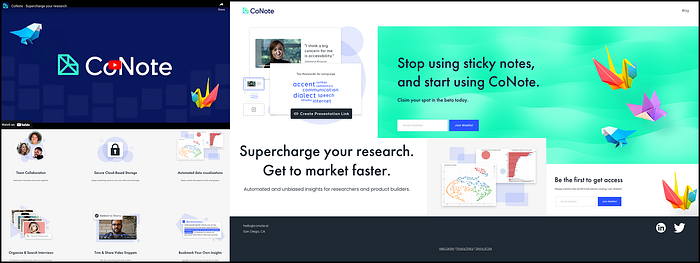
I recently had the opportunity to collaborate with CoNote, an innovative tech startup that is poised to disrupt user research with their cutting-edge tool. While their product is yet to be launched, I was tasked with redesigning their existing landing page which can be seen in the video below:
CoNote’s landing page still looks pretty raw. It already has a great visual identity, but it lacks information!
Project Background
CoNote is a San Diego-based tech startup founded by a team of innovative industry experts who have experienced the challenges of conducting user research firsthand. Recognizing that the process can be time-consuming, they set out to create an AI-powered tool that addresses this issue. With CoNote, users can easily upload interviews, which are automatically transcribed and analyzed to provide insights within minutes. The platform also enables collaboration and the automated creation of presentation-ready charts, quotes, and snippets from interviews. The beta version of the tool is slated for launch this summer, and CoNote aims to revolutionize UX research.
As an enthusiast of powerful AI tools, I was excited to discover CoNote and their mission. Having experienced the frustration of time-consuming user research myself, I was eager to collaborate with the company. As part of a team of four, I was responsible for various UX design tasks, including information architecture, interaction design, and UX writing. Additionally, I conducted extensive user, business, and design research to inform our approach. Armed with a brief, a style guide, and a prompt to improve CoNote’s landing page, we set out to tackle the challenge.
Two weeks later, we presented our findings and recommendations to our client, impressing them with a strong prototype that set the stage for future success. But before we dive into the details, let’s start at the beginning.
OVERVIEW
1) Research
2) User Stories
3) Journey Map
4) Problem and Solution
5) Design References
6) Sketches
7) Information Architecture
8) Wireframes
9) UX Writing
10) Clickable Prototype
11) Usability Testing
12) Next Steps
13) Final Thoughts


1 ) Secondary Research: We quickly recognized that CoNote had a strong product with the potential to revolutionize user research. However, we also identified a potential obstacle: many people are skeptical of AI-powered tools. With the evolution of ChatGPT and its controversial impact on society, concerns around safety and security have grown, even as the platform has gained over 100 million users in just two months.
While CoNote may not reach the same level of popularity, it could still make a significant impact on the UX and Product Design industry, provided that it is mindful of its branding and maintains rigorous security and safety standards. CoNote aims to automate UX research, remove bias in synthesis, and accelerate time-to-market for companies. Its powerful AI engine transcribes interviews, identifies common themes, and organizes insights in just a matter of minutes. Users can easily import interview files and receive presentation-ready slides with charts and direct quotes to impress clients, stakeholders, or team members. Indeed, the presentation feature is a significant selling point, highlighting the platform’s ability to deliver powerful insights quickly and effectively. By ensuring that it addresses user concerns and maintains a strong brand identity, CoNote has the potential to become a game-changer in the user research space.

2) Competitive Research: Despite AI-powered research in UX being a relatively new idea, CoNote already has some strong competitors in the market, including Dovetail, UserTesting, EnjoyHQ, Condens, and Notably. After analyzing these competitors, we identified several key takeaways for CoNote:
Firstly, while competitors typically brand their services as “Customer Research” or “UX Research,” we recommend that CoNote differentiate itself by branding its service as “User Research.” This term more accurately reflects CoNote’s current services, as opposed to the broader term “UX Research,” which encompasses research methods that CoNote does not yet provide.
Additionally, competitors use animations or images on their landing pages to provide insights into their products’ processes, allowing users to quickly understand how the dashboard works and which processes are included. To compete, we recommend that CoNote ideally provide animations or powerful images to showcase their product’s features and benefits to potential users. This will help CoNote to stand out in the competitive market and attract new customers.
3) Survey: During the project, we conducted a survey with two main objectives: to recruit users for interviews and to gauge user sentiment towards AI tools, particularly in the context of user research. Here are the key takeaways from our findings:
- More than half of the surveyed freelancers and employees (51.7%) have already used AI tools for their work and perceive them as helpful. Additionally, 28.6% expressed interest in trying AI tools for the first time. All of the surveyed students reported having used AI tools for their studies.
- Interestingly, participants felt mostly curious but also nervous about the prospect of AI tools potentially taking over parts of their work. It’s clear that while users are open to using AI tools, there is still some apprehension about their impact on the workforce.
4) User Interviews: After conducting seven interviews with UX design managers, designers, researchers, and students, we identified key insights using an affinity map:

- Privacy and Security: Interviewees expressed concern about unethical practices involving sensitive information. One participant stated, “For work, I would never put sensitive information into it without getting some reassurance from leadership that it’s safe.”
- Transparency: Users want to understand how AI tools are developed and how data is generated. A senior UX designer mentioned, “In order for me to trust an AI tool, I need to know exactly how the process works.”
- Understanding of AI in UX: On average, there’s a strong lack of knowledge about AI and its potential usefulness in general.
- Patterns and Themes: Participants recognized the importance of organizing data but were aware of the time-intensive nature of this task.
5) Business Research: Let’s talk business! What’s a great design concept without any business potential?
CoNote offers a strong value to their customers: Users can save time and money. Researchers have to do less of the “dirty work” and can take more strategic roles. Synthesis becomes less biased. Users can make better-informed decisions, have more time for other tasks, collaborate easily and share findings, design better products, and last but not least have fun (again?) in research. I’m sold!
Who are the potential customers though? Clearly, this product is very attractive to user researchers. But more broadly, anyone conducting, using, or managing UX research could be of great interest in CoNote. Actually, all companies with digital products or services would strongly benefit from using CoNote. That’s a great market!
Since CoNote has a handful of strong competitors, it has to invest in great customer relationships. CoNote should offer a freemium model, provide individual, team, and business accounts, and offer help support at least through a chatbot. Ideally, CoNote would offer human tech and customer support, since CoNote’s service is already strongly AI-based and therefore lacks human aspects at least at the first site.
6) Usability Testing: We conducted usability testing of CoNote’s website with one senior UX designer and two UX design students, and here are the key findings:
Positive results: CoNote is perceived as a promising product, and the website is easy to navigate (Ease of use 4/5). Users appreciate the video that provides information on CoNote, and they find the presentation of features to be effective. The visual elements, such as layout, fonts, colors, and origami birds, are appealing.
Pain points: Users want information about the product before being asked to sign up for the beta version. One user said, “I don’t even know what this is. I’m not going to give you my information yet.” Users wonder about the details of signing up for the beta, such as the duration and use of their email. Users find the hero section “empty” and “underwhelming” and expect more information about the features when they click or hover over the items. Users miss company and team information and want to know who is behind the tool. They also find the writing less intriguing and the video “underwhelming,” and they wish to see the tool in action. Additionally, users want a preview of the dashboard to better understand the product.


CoNote’s primary target users are user researchers, but the tool could also benefit anyone involved in UX research within digital product companies. To help better understand users’ needs, we developed three user stories:
- The UX Researcher: This user wants to use an AI tool to transcribe and analyze user interviews and tests, allowing for quick identification of patterns and trends based on user needs and preferences. They also want to present their findings to the design team with compelling visualizations and direct quotes.
- The Product Manager: This user wants to use an AI tool to streamline collaboration with team members, speed up the research process, and gain early insights into findings. By doing so, they aim to improve their design strategies and develop better products.
- The Stakeholder: This user is interested in using an AI tool to optimize the UX process of their product. They hope to increase user satisfaction, retention, and work efficiency, ultimately leading to business growth.

Based on our user research, we created a journey map to represent the average user’s experience when navigating CoNote’s current landing page. The journey map shows that users generally start with a neutral attitude and are interested in learning more about CoNote. However, as they navigate the website, they encounter some pain points such as the lack of information and transparency, which leads to frustration and a decrease in interest. Users express a desire for more information and are hesitant to sign up for the beta version without knowing what it entails. They want to know more about the team behind the tool and see a preview of the dashboard in action. Overall, the journey map highlights the need for CoNote to address users’ pain points and provide clear and transparent information to increase user engagement and interest in the product:
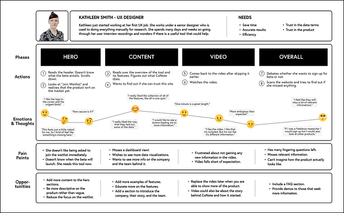


Problem: When entering CoNote’s landing page for the first time, users are challenged by finding out what CoNote offers, why it should be considered over its competitors, and how it’s safe to use. In addition, users struggle to find out about the company’s values and vision.
Solution: CoNote’s landing page should be redesigned by improving the navigation and providing short information packages that are expandable and quickly showcase CoNote’s main features, safety standards, and other relevant company information.

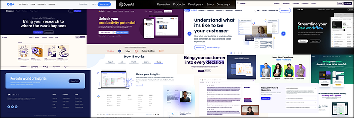
After narrowing down the solution statement, I began collecting design references. To inform my work, I examined competitor websites and researched contemporary UX design trends. Specifically, I paid attention to the arrangement of main navigation and call-to-action elements like hyperlinks and buttons in the top bar. I also looked for visual design elements and content arrangements that would be suitable for CoNote. Furthermore, I searched for an optimal way to integrate a call-to-action field within the footer section:

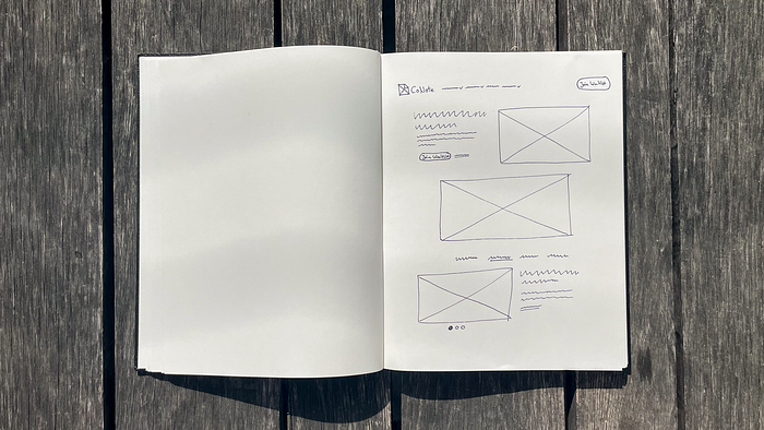
Drawing on my design references, I began creating wireframes for CoNote’s landing page. Through numerous iterations, I explored various options before sharing my sketches with the team. After reviewing and incorporating their feedback, we collaboratively selected the best solutions.

One of the most exciting tasks for me when working on this project was creating the information architecture. I believe that information is key when it comes to showcasing an AI tool and gaining the trust of potential customers. When designing the information for CoNote’s landing page, it was important to keep in mind that users needed to be guided towards a CTA, which is currently “Join Waitlist” but will later change to “Sign up” or “Start for free” after launch. Additionally, it was crucial for CoNote to quickly clarify its services and features, address security concerns, and establish its reliability.
To achieve this, I created content maps for the entire landing page as well as detailed maps for the top bar and footer. Since CoNote did not yet have an established main navigation, it was a challenge to come up with the right features. After researching market standards and user needs, I decided to include three main categories: “Product”, “Resources”, and “Company”. However, I also added “Safety” to the main navigation since all users expressed safety concerns. I was inspired by OpenAI, the company behind ChatGPT, and believed that it made sense to make information on safety standards easily accessible to users rather than forcing them to search through secondary navigation or other areas.

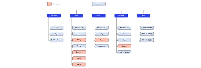
When designing the footer, I opted for a layout with one row and four columns. To ensure that the most relevant information is easily accessible, I arranged the columns under the headings “Product,” “Resources,” “Company,” and “Safety.” Since safety information is already included in the main navigation, I didn’t consider it as critical to be listed separately in the footer. Instead, I included it under the “Product” section, where users can quickly find information about CoNote’s safety features and standards.
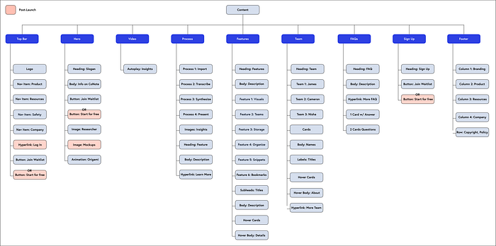
After mapping out the top bar and footer, I organized all the landing page elements, put them in order, and listed content details. One notable feature of this project is that we included a team and a condensed FAQ section on the landing page. I added the team section to address users’ concerns about the company and the team behind it. By including this section, we are adding a human touch, building empathy, and establishing trust. The brief FAQ section is designed to quickly answer common questions related to CoNote’s launch, safety concerns, and more.

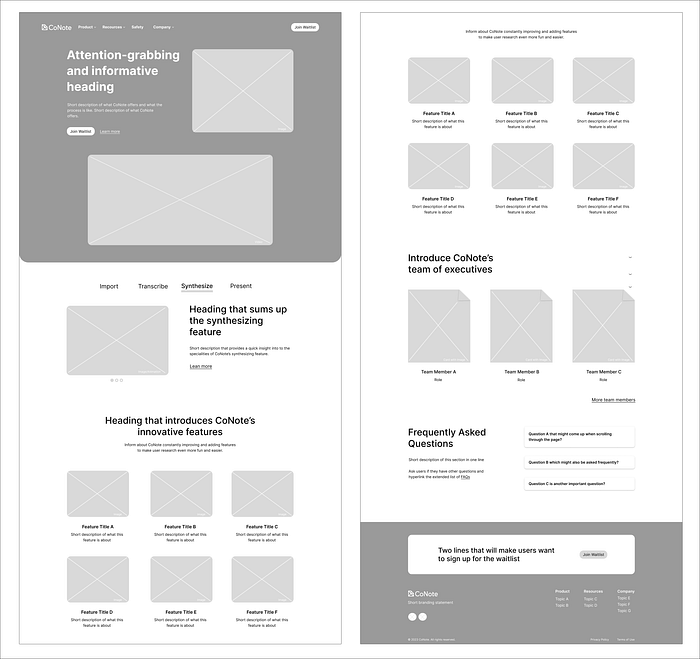
Based on my content mapping and sketches, we began constructing wireframes in Figma. The wireframes include my initial ideas for UX writing. Here are my personal versions:
I developed wireframes for the navigation dropdown menu based on my design references:

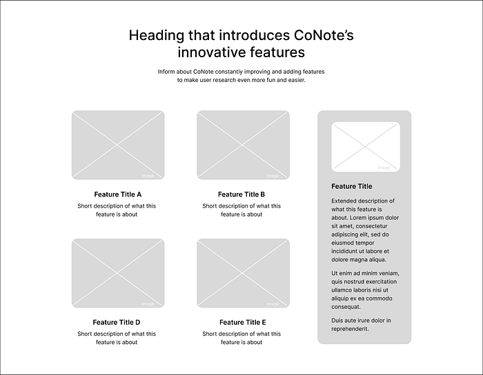
To address the issue of users being unable to find information about CoNote’s features, we decided to incorporate hovering cards. These cards not only maintain a clean and organized appearance but also provide an interactive element to the user experience. This solution was implemented based on feedback from users who expressed their disappointment with the lack of feature information.
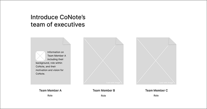
We applied a similar approach to the team section by using hovering cards that display additional information when users hover over them. While keeping the cards clean and simple, this interactive element provides users with more details about the CoNote team, addressing their concerns about the company’s background and building trust through transparency.


When crafting CoNote’s brand voice, my goal was to convey professionalism and innovation, based on our research findings. To achieve this, I created skimmable and informative text that was easy to understand and engaging for users:
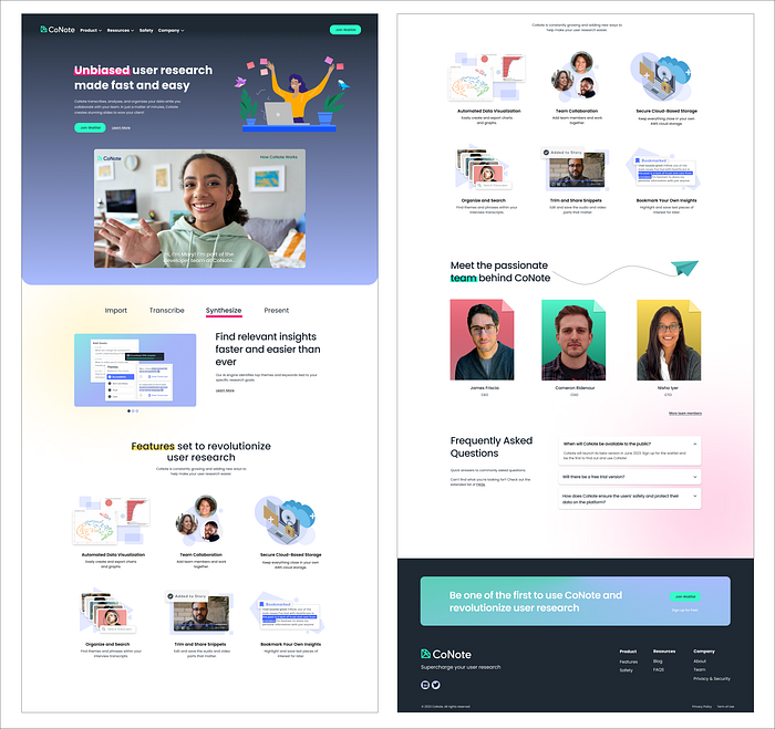

Our team successfully developed a high-fidelity prototype for CoNote’s landing page by incorporating our research findings and design recommendations:


We conducted two usability tests with UX design students, and we were pleased to receive mainly positive feedback. Users enjoyed the website’s appearance and found the interactive and slightly playful elements engaging. They were able to grasp the product’s purpose within a few seconds, and appreciated the information on the team behind CoNote, which instilled a high level of trust in the company and its product. Here are a few quotes from the users: “I think it feels super trustworthy and it really emphasizes this is here to help you,” “It looks all great. So, I would want to join,” and “My overall impression here is that this looks really professional.”
However, we also identified a few pain points. Users expressed a desire for a dashboard preview and information on whether the product was a web app, native desktop, or mobile application. They also wanted to know what uploading their data to the site would entail. One user remarked, “I don’t know if this is something that they have yet, but what it looks like when you sign in would be nice.”
Based on this feedback, we recommend that CoNote provide more information to their website users and increase transparency. Providing video and image mockups of the product as soon as they are available would also be highly beneficial.

We presented our research findings and design recommendations to the CoNote team, who were thrilled with our results. They plan to implement many of our designs in order to relaunch their site. We are excited about their future and can’t wait to use their fascinating product for our UX design work and make research finally fun and easy!
Thank you for your time! I’m curious to hear your thoughts on our research findings and design suggestions. Also, will CoNote revolutionize user research?
